The end of an era
I know there are people in the scrapbooking world who are incredibly sad about Two Peas closing and others who think that their end came as a result of negativity and cliquishness in their online community, which left unchecked pushed people away.
I have read many more accounts of crafters feeling their closing as a loss, though. And even though I wasn’t a frequent forum visitor, I did share my projects in their gallery and gain tons of inspiration from others’ work and the Garden Girls’ videos. I am one of those who is sad to lose Two Peas.
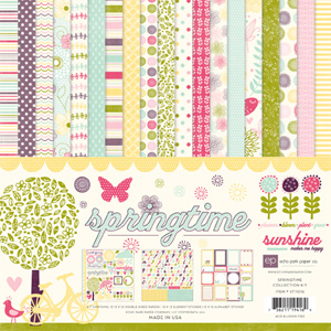
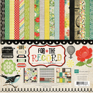
I didn’t place many orders from their store over the years. But it was me, not them. Until recently I have been terribly lucky because I didn’t need to buy my supplies online. I had local scrapbook stores and later a nearby Archiver’s. But over time the LSSs closed, and as everyone knows, so did Archiver’s. So when I recently won a contest where the prize was a gift card to the scrapbook store of my choice, I chose Two Peas because I had bought there before and had a good experience.
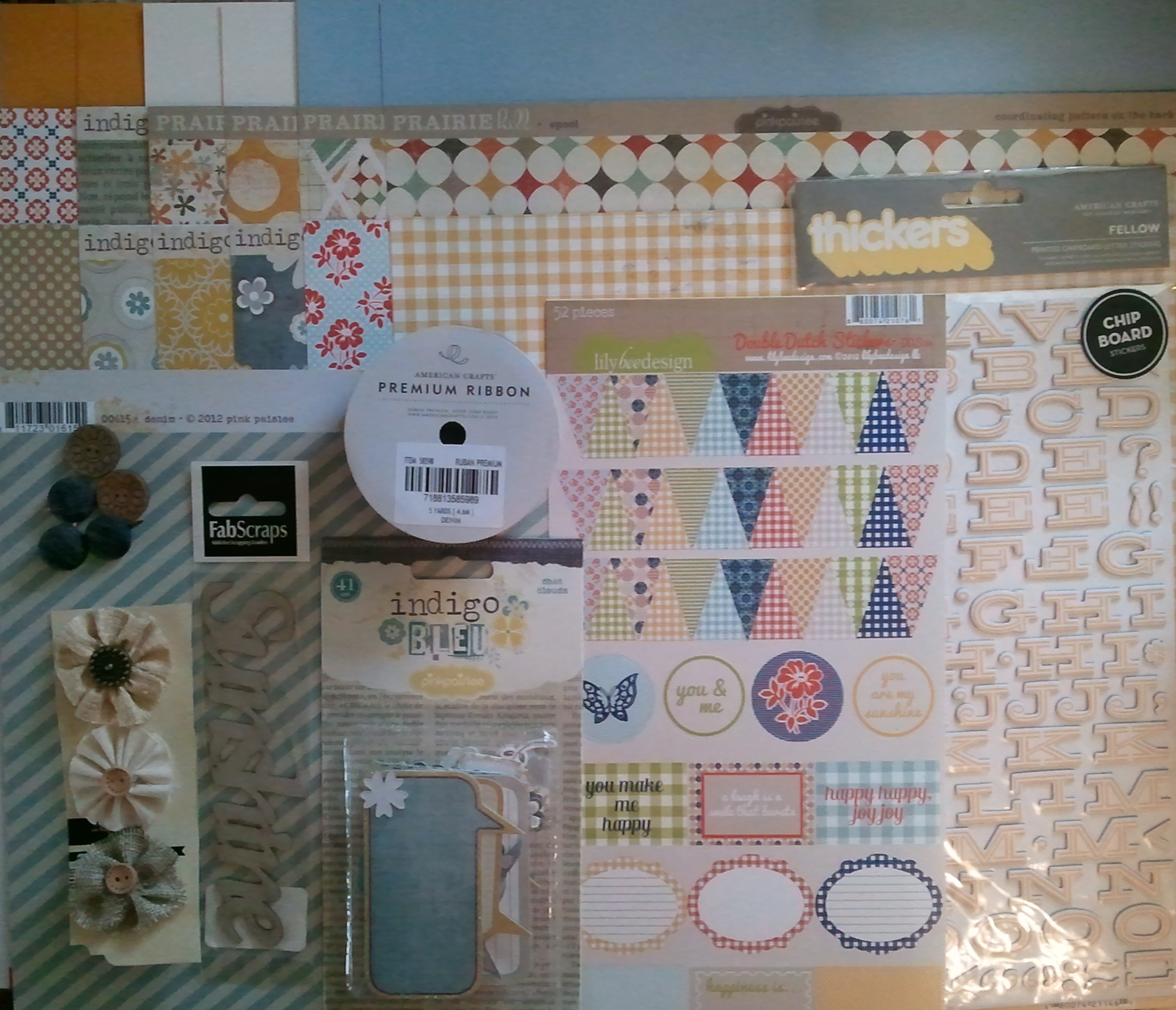
Oops. As soon as I heard about the big closing sale I hurried over to attempt to use my gift card before all the good stuff was gone. Wow, was that stressful shopping! It seemed like every time I put something in my cart it would fall right back out. Inventory was “flying off the shelves,” as they say. It was fast and furious, Tokyo drift! I was able to use my gift card, although my order was full of random, rather unrelated items. But I like it all and will be sure to enjoy using it.
Here’s to all the great things Two Peas did for the scrapbook community for 15 years.
The whole shebang
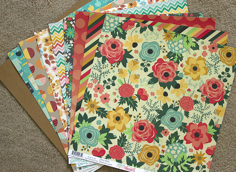
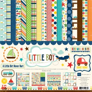
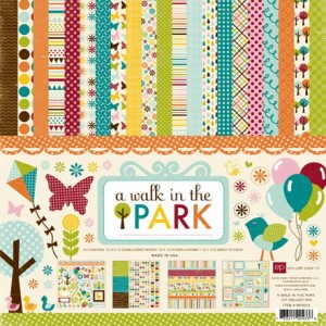
Just the papers
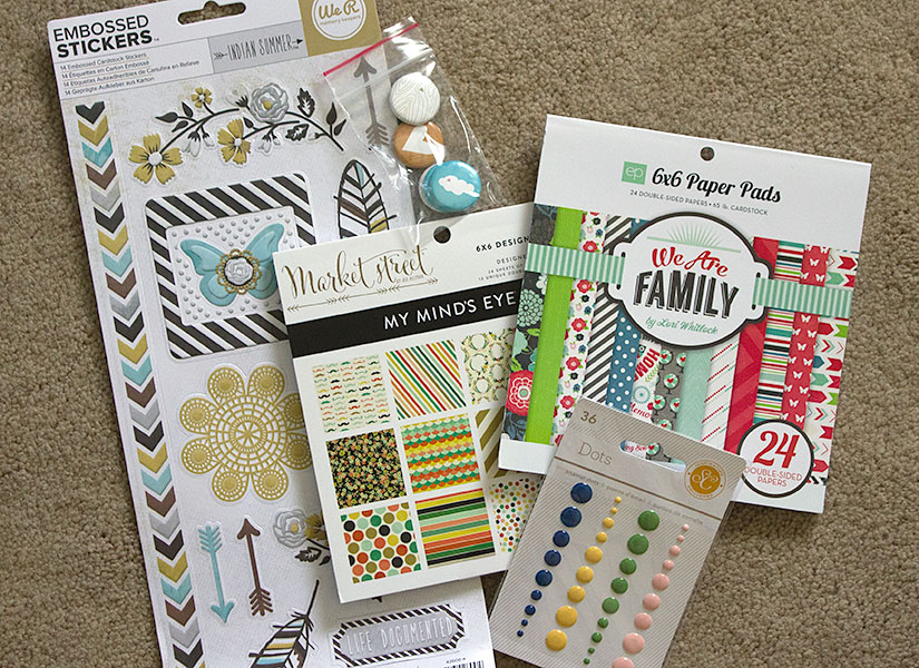
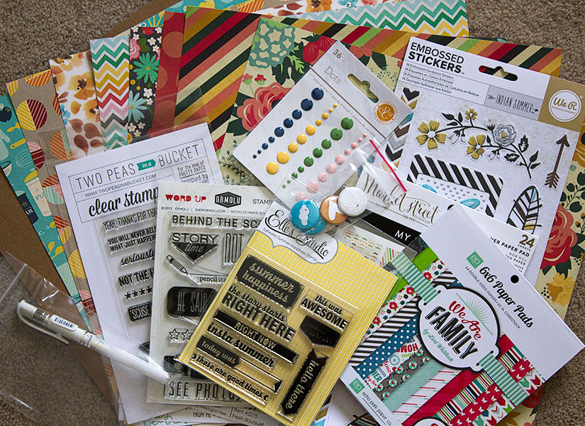
The 6x6 pads, stickers and embellies
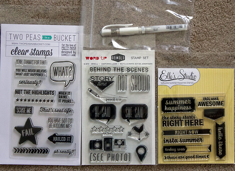
The stamps