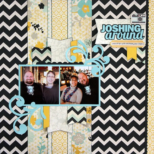
Matt and I have known Josh for at least 10 years now. He’s a loving, fun and funny teddy bear, so I wanted to dedicate a page to our friendship with him. He’s a good guy and a good friend. These photos are from a lunch date we had with him back in November.
I knew what my title would be for this layout before I even began working on it because I’m a punny girl and I liked the play on Josh’s name too much not to use it. I did a little research to find out where the phrases “joshing around” or “just joshing you” came from, and what I learned is very interesting:
Josh Tatum was a deaf mute who was able to use an oversight of the US Mint to his advantage. In 1883, the Mint produced the newly designed Liberty nickel. On the reverse of the coin, the design featured a Roman numeral “V” but nowhere did the word “cents” appear. Realizing an opportunity, Mr. Tatum had several of the newly minted cents electroplated with a thin layer of gold. Tatum then traveled from town to town visiting stores and buying items with a value less than 5 cents. When the clerk rang the item up, Tatum handed over one of the gold-plated nickels. The store clerks usually assumed that the coin was a $5 gold piece and would give Mr. Tatum change. Tatum amassed quite a bit of money before being caught by police. He was found innocent of charges because as a mute, Tatum had never actually represented that the coin was a $5 gold piece! That same year, the US Mint added the word “cents” to the Liberty head nickel in an effort to bring this type of fraud to a halt. And the famous saying was born: “You’re not joshing me, are you?”
So now you know!
Product/technique notes
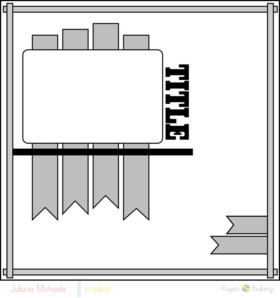
I just loved the “kitty” t-shirt that Josh was wearing in these photos, so I went in search of papers that had black, aqua and gray in them. Fancy Pants’ “Park Bench” collection fit the bill perfectly. I designed the title and cut it and the flourishes (Design ID #19030 in the Silhouette store) on my Cameo. I used Paper Bakery’s sketch #18 as inspiration for my design.


Loving the colours on here!! This is fabulous!!
What a fun layout! I love all the colors and patterns!
Hahaha i love the title… fabulous take on the sketch . thanks for playing at PB
What a great layout and take on the sketch Janet! Love the story behind the title too!!!
These colors are fabulous! Great layout!
Very nice take on the sketch! I love the color palette that you used! And the title is cute! Thanks for playing with us Paper Bakery!
Hi Janice!! This layout is fabulous! The colour combo is so striking and I really love your take on the sketch!! So glad you could join us @Paper Bakery!