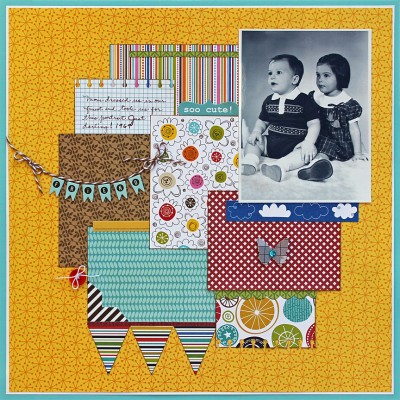
How cute is this photo of me and my little brother from 1969? I know: we were cute, our outfits were cute, the expressions on our faces were cute, the way the photographer had us positioned was cute. Cute, cute, cute! Now I will attempt to write the rest of my post without using that word even one more time (for your sake as well as mine).
So how could I fail to use sweet, colorful patterned papers to highlight all this adorableness? I wanted this layout to feel bright and colorful and young and fresh, so I turned to some of the older lines (Family Dynamix, Tail Waggers & Cat Naps) as well as one new line (Making the Team) from Bella Blvd.
And I think this got the job done, don’t you? The bright colors show off the black-and-white photo rather than competing with it. Also, portraits can sometimes feel a little stale, so by surrounding this one with fun banners, butterflies and buttons I kept the eye hopping and happy. At least I think so! What do you think?


Leave a Reply