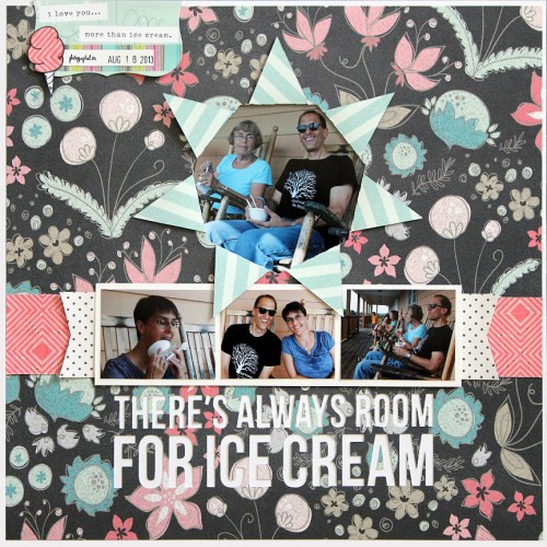
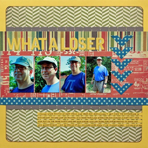
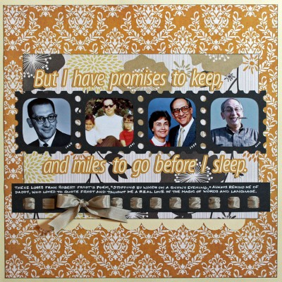
I thought I would share a Silhouette technique today. I had a lot of fun concocting this layout in my head, then in my Silhouette Studio software and finally in physical form.
I completed this look by building the page as much from the back as from the front. Here’s how:
I was looking for a novel way of highlighting my main photo, so I started surfing my Silhouette library for ideas. When I saw this “Folded Sunburst Card” shape, the light bulb went on. Why not cut the sunburst aperture from my background paper and put the photo behind it?
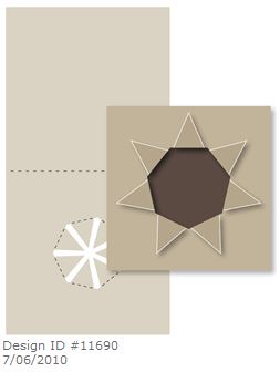
So I opened the file and deleted all the card bits, leaving only the sunburst. I re-sized the shape to be a little smaller than a 4 x 4 photo and dragged it to the top third of a full 12 x 12 page in Silhouette Studio.
To add to the building from beneath theme, I set up my title to cut from the background paper as well. So that I would be sure to leave enough room between the sunburst and the title for the other photos I planned to use, I added those to the design in Silhouette Studio but I set them to “no cut.” Like this:
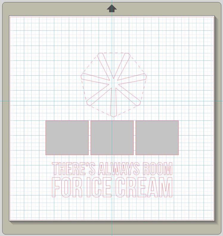
So that’s it. I laid down my patterned paper (from My Mind’s Eye “Cut and Paste: Flair” collection), cut this out all at once, backed it with white card stock and then built my page on top of it. And now I have a layout that has lots of depth and texture without lots of bulk.
Oh, and the photos are from a stop we made at a neat little ice cream place in North Carolina while I was home visiting Mom and Phil this August.
