Twisted Sketches has revealed its latest sketch, #112, and the twist is “fun.” Be sure to head over to the site to grab the sketch, then create something and link it up! 🙂
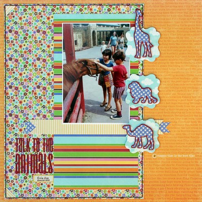
Here’s my Design Team layout inspired by the sketch. The patterned papers I used on this very colorful layout are from Jillibean Soup. The colors just went so well with my vintage photo.
That’s Phil and me at the Erie Zoo in Pennsylvania in August 1974. There’s so much I love about this photo: the great outfits Mom always picked for us (I adored that quilted skirt and remember looking down at those sandals on my feet all summer), that we’re not cheesing for the camera but engrossed in a moment and the signs of 1974 hairstyles and clothes on the people in the background. It’s a great snapshot!
I cut those animal embellishments with my Silhouette using a free dingbat font called Zoologic. They cut out beautifully, and I really think they added a lot to the design.
Here’s a fun fact: I chose to include images of the giraffe, lion and camel for a reason. It’s because most mammals move both legs on one side and then both legs on the other side. The only mammals that walk by alternating their legs in sequence are…you guessed it…the giraffe, the cat and the camel! Cool, huh?


Leave a Reply