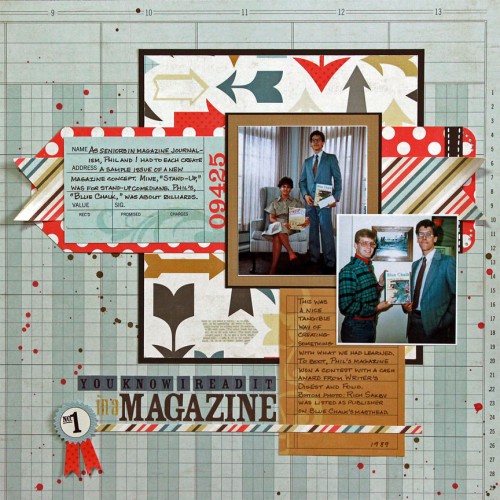
Not only did my younger brother, Phil, and I start school in the same year, which led to us travelling through grade school and high school together as though we were twins, but also we elected to go to the same university for the same major! Yessir, we both packed up our things and went to Ohio University for journalism degrees. And once we had been there long enough to figure out which kind of journalism we wanted to specialize in, we both chose the magazine track.
So after studying the principles and ethics of journalism for four years, we were thrilled to have a course in our senior year that allowed forced us to craft our own magazines. Each student had to come up with a concept for a magazine that didn’t already exist, write the business plan for it and then create a prototype of the premiere issue. What a dream project for a couple of magazinophiles.
Phil’s magazine for billiards enthusiasts was called “Blue Chalk.” My magazine for comedians was called “Stand-Up.” We had to mock up articles, ads…the whole magazine experience. It was hard work and exhilarating. But we both felt quite proud of our final projects. In fact, Phil’s book won a contest with a cash award from Writer’s Digest and Folio Magazine!
These photos were taken just after the ceremony where Phil received his award. And the bottom photo is of Phil and our friend, Rich, who was listed in “Blue Chalk” as publisher.
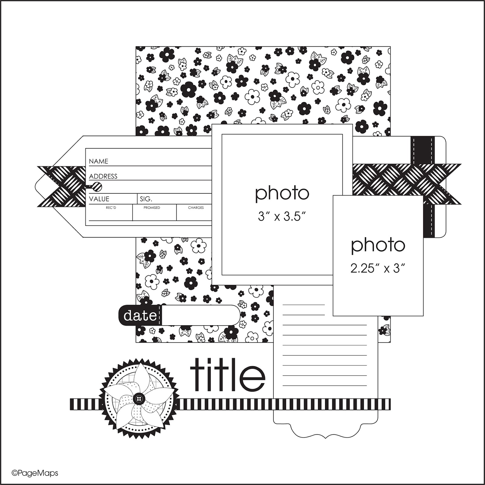
Here is the PageMaps sketch I followed for this layout, and I’m entering it into their sketch contest:

Product/technique notes: All the papers and stickers I used on this layout are from Echo Park’s Note To Self collection. I should also give credit where it’s due: Phil suggested the title I used on this page. 🙂


Terrific layout! The Note to Self collection is one of my favorites, and I love how you’ve put all the elements together. But now I’ve got that song in my head (should be “maga -za -ine”! hah!)