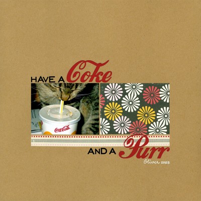
Today’s layout is one I have been wanting to complete for some time. This photo is from 2003, which means it was taken with one of the early digital cameras. Do you remember the ones that took 16×12-inch photos in 72dpi? That’s a small low-resolution photo, which means that in order to print it and retain good resolution I had to make it 4×3 inches.
So, the question was how to take a darling but small photo (in relation to the 12×12 page) and keep the focus on it without sacrificing the fun of design. Simplicity was my answer. By mirroring the size and shape of the photo with one patterned paper and underlining it with a border sticker from the same line, I satisfied my need to use patterned paper (my weakness) without overdoing it. Then I finished off the look by using my Silhouette to cut the title from a free Coke font I found online.
I really love complex, layered designs. But sometimes simplicity leads to a more dramatic result.


Janice, I ADORE this one! From the actual pic (what a great kitty!) to the layout! LOVING yor website also!
THANK you, Susan! I’m blushing (and so is Oliver). 😉