• Skip to primary navigation
  • Skip to main content
  • Skip to primary sidebar
  • Skip to secondary sidebar
  • Home
  • About me

The Constant Scrapper

If I'm not scrapbooking I'm thinking about scrapbooking!

one-page layouts

Designing 12×12 pages with 6×6 paper

January 5, 2011 By Janice Daquila-Pardo Leave a Comment

When new collections come out by my favorite scrap companies I am always tempted to buy. But I rarely get the whole collection because no matter how much I like (even love) it, I just can’t imagine wanting to create that many layouts out of the same look. Add to that the fact that collections have become so expensive. So I have been for some time buying the 6×6 paper pads that many companies are issuing. They have long been favored by card makers because of their smaller-sized patterns, and I quite like the lower price tag as well.

So I am always on the hunt for ways to use pieces of patterned paper that are 6×6 or smaller on my 12×12 layouts. When I find good ways to do this I will share them here in case you, like me, have several 6×6 paper pads waiting to make it into your designs.

Below is my first sketch with this in mind. I based it on the design I shared yesterday, which was called “Calendar girl.” If you use this sketch in a design please link to it in the comments. I would love to see what you create with it!
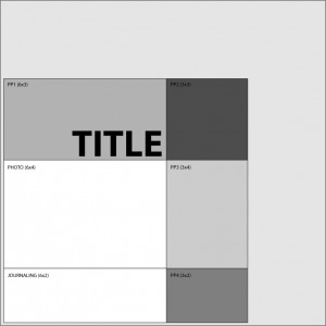
The Constant Scrapper sketch 1

Sketch #1 uses 1 photo and 4 patterned papers

Filed Under: 12x12 layouts using 6x6 paper, Sketches Tagged With: 1 photo, one-page layouts

Our calendar girl

January 4, 2011 By Janice Daquila-Pardo 1 Comment

It’s time to pull out our new calendar, and this time I’m more excited than usual about the task. The calendar we’re going to use this year is special to us.

Here’s the story:
A few years ago my brother, Phil, gave us a Cat Fancy calendar. Each day had a photo of cats and some random cat fact. Throughout the year I tore away each day and read the facts. Then near the end of the calendar was an invitation to send in up to three photos of your own cat(s) for consideration in their upcoming calendar. The payment if any of your photos were chosen would be two of that year’s calendars.

Because everyone believes their kids are the brightest and their pets are the cutest, I figured there would be a lot of people sending in photos for the chance to show off their cats. In spite of all the imagined competition, I decided to send in my three photos and see what happened. For a while I waited expectantly to hear that they’d received them. Nothing. After a while longer I thought they would just let me know which one they had chosen to use (because I really believed they couldn’t say no to all three of my entries; they were just too good!). But a long time passed and I never heard anything, so I just forgot about it and chalked it up to their bad taste. 😉

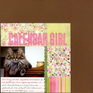
Fast forward a year and a half (a few months ago): A package arrived with two 2011 Cat Fancy calendars and a letter telling us on which date our cat was featured! What?! It’s a weird feeling to think something is all over and then have it show up again in your life. Well, we are very proud of our darling Lucy, so I’ve immortalized the chosen photo in a layout (of course).

Here’s the layout:

Calendar girl

Cat Fancy fancies our calendar girl

Filed Under: 12x12 layouts using 6x6 paper, My scrapbook layouts Tagged With: 1 photo, one-page layouts

Using non-traditional colors in a Christmas layout

December 18, 2010 By Janice Daquila-Pardo 1 Comment

Color plays such an important part in our layouts. It gives our viewer a quick insight into its theme. It sets the mood for the story we want to tell. It brings all the elements together into a cohesive whole. It highlights the portions of the photos that are most important to us.

How do you choose colors for your layouts?

  • Do you pick a color from the main photo and build from there?
  • Do you choose colors that are traditional to the theme you’re covering (as in pink for a baby girl page)?
  • Do you first choose papers with colors that you want to work with and then select photos to go with them?

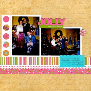
I generally start with colors from my photos rather than those that are traditional to the event/season. For instance, in my Christmas layout below I could have chosen red or green as my base color. But I decided that the strongest colors from these 1990 photos were the hot pink in my mother’s skirt and the gold of our family room walls. I felt that these colors should not be ignored, lest they distract from the final look and feel by clashing with a traditional Christmas color scheme. Lucky for me, I had a few sheets of Christmas-themed paper form KI Memories that included hot pink and gold! How great is it when that happens?

The result is a layout that has what I would call a “groovy traditional” feel. In other words, it still looks like a Christmas layout, but the hot pink, gold, brown, green and green-blue color scheme shakes things up a bit. So the layout stays true to the photos.

Jim's Christmas visit in 1990

My college best friend, Jim, visited my family for Christmas 1990

Try scrapping some of your seasonal photos using colors that are not the norm. It can give your designs the freshness of new-fallen snow. 🙂

Filed Under: My scrapbook layouts, Tips Tagged With: Christmas, color, one-page layouts

Vintage Christmas layout

December 16, 2010 By Janice Daquila-Pardo 1 Comment

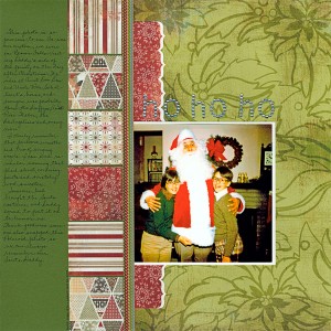
Ho Ho Ho layout

A vintage Christmas layout of my dear dad in Santa garb in 1976

Vintage photos are such a joy to scrapbook. They evoke strong memories and give us an opportunity to tell stories that might otherwise be lost in time. They hold the key to who we were and who we become. They preserve forever the favorite fashions and activities of days gone by.

I used to be a bit afraid of doing layouts with my vintage photos. Of course I scan them in and save the originals, so there wasn’t fear of damaging precious photos. But I was concerned about doing them justice. They seemed more important to “do well” than the everyday photos of our lives right now. But then I gave it a try and scrapped a vintage photo from my husband’s family (I know, I took the safe route by trying it with a memory not as close to my heart). But I loved working with the combination of old photos and new products. So I tried some more. I now find myself turning to older photos quite often when I have time to scrap. It really makes me happy to have completed another vintage layout (about my husband’s family or my own).

So this post is meant to be a nudge to those of you who have bins, boxes and albums full of old family photos that you’re nervous to start scrapping. Just give it a try. Pick one photo or set of photos of an event from your past that was fun but not a pivotal, life-changing moment. Keep it light. Scan the originals and either color correct them before printing or don’t. I personally like to get rid of scratches and pump up the color a bit, but I know other scrapbookers who prefer to leave them aged looking. I think any way you use a vintage photo looks great!

And my advice is don’t feel that you have to use only products that look vintage-y or heritage-y. Use products that are bright and fun and relevant to your story and that you love.

In case it’s too difficult to read the journaling on my layout above, here it is:

This photo is so precious to me. As was our custom, we were in Beaver Falls visiting Daddy’s side of the family on the day after Christmas. We were at Aunt Doo Doo and Uncle Ron Schollaert’s house, and everyone was probably there: the Duffys, Aunt Rose Weber, the DeAngelises and many more.

I clearly remember that pine cone wreath and trio of singing nuns. I can even remember wearing that plaid shirt, corduroy pants and scratchy wool sweater.

Someone had brought the Santa costume, and Daddy agreed to put it on to humor us. Thank goodness someone also snapped this Polaroid photo so we can always remember our Santa Daddy.

Filed Under: My scrapbook layouts, Tips Tagged With: Christmas, one-page layouts, vintage photos

You cannot win if you do not play

November 23, 2010 By Janice Daquila-Pardo 1 Comment

For a long time I’ve been a lurker online. I read blogs and shook my head, laughing at the funny things other crafters said. But I didn’t comment. I read product reviews and agreed or disagreed with the analysis. But I didn’t drop the reviewer a line about my opinion. I learned about scrapbook and card challenges and toyed with the idea of participating. But I didn’t send in my layouts for consideration.

However, with the start of this blog I decided that had to change. I had to stop lurking and start speaking up. And I admit that’s challenging for me. I can’t tell you how many times I’ve turned to my husband, Matt, at his computer and told him what I thought of things I had read online. And after patiently (usually) listening to my diatribe, he would often say, “You should be blogging this stuff. Or at the very least you should comment on that person’s post.” At the mention of sharing my thoughts publicly I usually just turned back to my computer to read more of what others had written.

When it comes to the challenges and contests I really just haven’t thought I could compete with all the talent out there in the world. There are so many amazing layouts being posted every single day! But that was just a lame excuse for not having to expose myself to critique—or worse, to ridicule.

So I’ve ended that by starting to throw my hat into the ring every so often. It has been so motivating and much more fun than I expected it to be! I’ve even won a few times. Yay! But even more than the winning, I’m enjoying knowing that others are looking at my art. I just hadn’t realized how much that was missing from my process. I’m accustomed to finishing a layout, showing Matt for his approval, and then putting it in the appropriate album. Sort of a letdown, you know?

Well, last night I took the next step in this journey of making my crafting process more public and social. I submitted my work for consideration for a design team. Gulp.

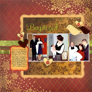
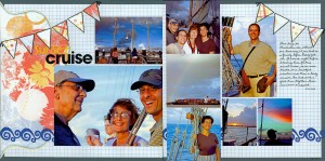
The assignment was fun because it involved working with sketches, which I really love anyway. I liked the sketches, and I’m proud of my resulting layouts. So I feel like I won even if I’m not chosen for the team. Here are my submissions:

Baptized

Baptized

Sunset cruise

Sunset cruise

Filed Under: Layouts based on sketches, My scrapbook layouts Tagged With: 3 photos, 8 photos, American Crafts, banner, border punches, emotional journaling, Fancy Pants, Hero Arts, Making Memories, Martha Stewart Crafts, one-page layouts, Silhouette, Spellbinders, stamping, Technique Tuesday, The Paper Studio, two-page layouts, vintage photos, We R Memory Keepers

« Previous Page
Next Page »

Primary Sidebar

Thanks for visiting!

Hi, I'm Janice.

Follow me

Follow on Bloglovin

My sketches on Pinterest

Design team

I am a proud Stuck?! Sketches designer!

Past design teams

Scrap & Music sketch designer

Creative Scrappers sketch designer

Sketches With a Twist sketch designer

Sketchabilities design team

Twisted Sketches design team

Secondary Sidebar

Topic categories

  • 12×12 layouts using 6×6 paper
  • Cards
  • Freebies/giveaways
  • Layouts based on sketches
  • Layouts using 3×4 journaling cards
  • My scrapbook layouts
  • Reviews
  • Scrapbook products
  • Sketches
    • My sketches
  • That redo that you do
  • Tips
  • Tutorials
  • Uncategorized

Archives

Tags

1 photo 2 photos 3 photos 4 photos American Crafts banner Basic Grey Bella Blvd Blogtoberfest border punches cards Christmas Copic coloring Crate Paper Creative Scrappers Echo Park emotional journaling Fancy Pants Halloween hand stitching Jillibean Soup Little Yellow Bicycle Making Memories Martha Stewart Crafts My Mind's Eye October Afternoon one-page layouts Pebbles Pink Paislee rosette Scrap & Music sketches scrapbook philosophy Silhouette Simple Stories Sketches with a Twist Sketch Support Spellbinders stamping Stuck?! Sketches Tim Holtz Distress Ink tutorial Twisted Sketches two-page layouts vintage photos We R Memory Keepers

Copyright © 2010-2018 The Constant Scrapper