• Skip to primary navigation
  • Skip to main content
  • Skip to primary sidebar
  • Skip to secondary sidebar
  • Home
  • About me

The Constant Scrapper

If I'm not scrapbooking I'm thinking about scrapbooking!

December 18, 2010 By Janice Daquila-Pardo 1 Comment

Using non-traditional colors in a Christmas layout

Share on pinterest
Pinterest
Share on facebook
Facebook
If you like this, please share!

Color plays such an important part in our layouts. It gives our viewer a quick insight into its theme. It sets the mood for the story we want to tell. It brings all the elements together into a cohesive whole. It highlights the portions of the photos that are most important to us.

How do you choose colors for your layouts?

  • Do you pick a color from the main photo and build from there?
  • Do you choose colors that are traditional to the theme you’re covering (as in pink for a baby girl page)?
  • Do you first choose papers with colors that you want to work with and then select photos to go with them?

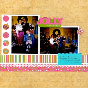
I generally start with colors from my photos rather than those that are traditional to the event/season. For instance, in my Christmas layout below I could have chosen red or green as my base color. But I decided that the strongest colors from these 1990 photos were the hot pink in my mother’s skirt and the gold of our family room walls. I felt that these colors should not be ignored, lest they distract from the final look and feel by clashing with a traditional Christmas color scheme. Lucky for me, I had a few sheets of Christmas-themed paper form KI Memories that included hot pink and gold! How great is it when that happens?

The result is a layout that has what I would call a “groovy traditional” feel. In other words, it still looks like a Christmas layout, but the hot pink, gold, brown, green and green-blue color scheme shakes things up a bit. So the layout stays true to the photos.

Jim's Christmas visit in 1990

My college best friend, Jim, visited my family for Christmas 1990

Try scrapping some of your seasonal photos using colors that are not the norm. It can give your designs the freshness of new-fallen snow. 🙂

Filed Under: My scrapbook layouts, Tips Tagged With: Christmas, color, one-page layouts

Reader Interactions

Comments

  1. Jim says

    December 19, 2010 at 8:13 am

    Jan…I cannot believe it was 20 years ago I visited your family!! If you want people to read your blog you might not want to put my face on here:)

    Reply

Leave a Reply Cancel reply

Your email address will not be published. Required fields are marked *

Primary Sidebar

Thanks for visiting!

Hi, I'm Janice.

Follow me

Follow on Bloglovin

My sketches on Pinterest

Design team

I am a proud Stuck?! Sketches designer!

Past design teams

Scrap & Music sketch designer

Creative Scrappers sketch designer

Sketches With a Twist sketch designer

Sketchabilities design team

Twisted Sketches design team

Secondary Sidebar

Topic categories

  • 12×12 layouts using 6×6 paper
  • Cards
  • Freebies/giveaways
  • Layouts based on sketches
  • Layouts using 3×4 journaling cards
  • My scrapbook layouts
  • Reviews
  • Scrapbook products
  • Sketches
    • My sketches
  • That redo that you do
  • Tips
  • Tutorials
  • Uncategorized

Archives

Tags

1 photo 2 photos 3 photos 4 photos American Crafts banner Basic Grey Bella Blvd Blogging for Scrapbookers class Blogtoberfest border punches cards Christmas Copic coloring Crate Paper Creative Scrappers Echo Park emotional journaling Fancy Pants Halloween hand stitching Jillibean Soup Little Yellow Bicycle Making Memories Martha Stewart Crafts My Mind's Eye October Afternoon one-page layouts Pebbles Pink Paislee rosette Scrap & Music sketches scrapbook philosophy Silhouette Simple Stories Sketches with a Twist Sketch Support Spellbinders stamping Stuck?! Sketches tutorial Twisted Sketches two-page layouts vintage photos We R Memory Keepers

Copyright © 2010-2018 The Constant Scrapper